What’s a website worth if you’re not getting your visitors to take an action? Do they know what they should do next? Don’t make them think about it too hard. It should be super easy to understand what you’d like them to do by using a “Call-to-Action” or CTA.
Here are 6 tips for effective Calls-to-Action (CTA) on your website:- Make the CTA stand out
- Use CTAs throughout your website
- Use different types of CTAs
- Make the CTA short and sweet
- Create CTAs for different stages of the decision-making process
- Try out different CTAs for the same thing (A/B Testing)
1. Make the CTA Stand Out
Your CTA should stand apart from whatever else is on the page. A bright color can help with that. Try to draw the user’s eye to the point on the page where you ask them to take an action.

2. Place CTAs Throughout Your Site
 CTAs should be used throughout your website, not in just one place. Every page of your website needs at least one call to action on it. That doesn’t mean it needs to be in the same place or look the same on every page.
 The goal of a CTA is to make it easy for your website visitors to know what step to take next. This means that the positioning of CTAs on your website is just as important as the design of them.
Let’s assume you have a “Buy Now” or “Sign Up” type button at the top of every page. What other CTAs could you use elsewhere on the site?
- Try a Free Demo or Download Checklist button in the main body of a page. This is for those who aren’t ready to take the big leap yet.
- Have a few CTA buttons on the home page as people scroll down. Especially on a phone, it makes it easier for the visitor to take action without scrolling all the way back to the top.
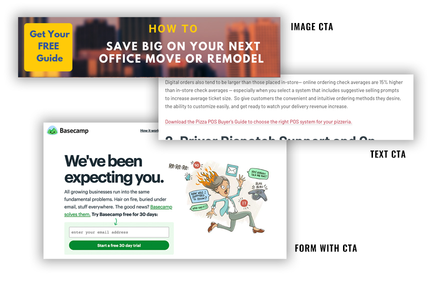
- Text CTAs are links to other pages or other content that doesn’t officially look like a button. These work well in blogs or in other areas where there is text. Add a CTA where it makes logical sense and you may be surprised.
Try to remember that a lot of people will scan your page to see if it’s what they need. Incorporating CTAs earlier in the content area that catches their eye will likely keep them on your site longer and click to see what you have to offer.

3. Use Different Types of Calls-to-Action
There are several kinds of CTAs. Try a few different types to see what works best.
- Button CTA: A link that looks like a designed button
- Text CTA: A text link that stands apart from the rest of the text on the page.
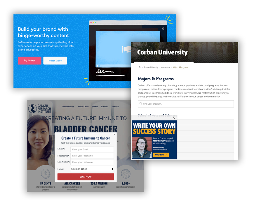
- Pop-up CTA: These can be located in the bottom right, left or center of the screen. They should have a short sentence with a button or form to fill out.
- Image CTA: this is a nicely designed CTA that catches the eye with a short message that gets visitors to click on it.
Use more than one CTA format per page. Different types of CTAs may be more effective in different locations on the page. One of them may stand out to someone scanning content on the page.
CTA Examples:

4. Short and Concise Calls-to-Action
Whichever type of CTA you use, you’ll want to make sure the text on it is brief and to the point. If someone is scrolling through your website, you have less than one second to grab their attention.
For buttons, try to make them short, sweet, and actionable:
- Start Now
- Sign Up
- Request A Demo
- Get a Free Consultation
These are just a few examples that you could use on a button that will let people know that by touching/clicking on it, they are taking a step forward in the process. Use a phrase that makes sense for your product or service.
For a text, image or pop-up CTA you can use a short sentence such as, “Learn more about how to create a marketing budget.”
Related Reading: 4 Ways to Make a Great First Impression With Your Website Design
5. Create CTAs for the Stages of the Decision-Making Process
Offer a CTA for visitors at various stages in the decision-making process.
- Information search stage: People who are early in their decision-making process may want to read your blog and download a helpful guide or checklist.
- Evaluation of alternatives stage: People further along in the process may be ready for a demo or access to a webinar (live or recorded) that gives them more details before they decide to buy.
- Purchase decision stage: And then you have people who are ready to get started. These are long the lines of
- Buy now
- Request a Quote
- Schedule an Appointment
6. A/B Test Your CTAs to Find the Most Effective Versions
Effective marketers try out different versions of their CTAs to see what gets the most response. This is easiest when you have software in place, like HubSpot's Marketing Professional or Enterprise, to create versions of your CTA and have them tested so you can see the results. Remember, when testing a CTA or a landing page only make 1 change between the A and B. Choose one of the following to test out:
- Headline text. On a CTA, it's usually just a headline. But if you test a landing page, only change the headline text at first to see what the audience prefers.
- The main image. One picture versus another can make a big difference.
- If your pop up CTA has a form, test the number of fields on the form. Asking too many questions early in the buyer's journey usually turns people off. But you can find a good threshold with some A/B testing.
How do you know if CTAs are working?
There are a few ways to track the effectiveness of your CTAs.
Marketing automation software
We use HubSpot to create and track our CTAs. Using marketing automation software, we are able to see things like:
- How often was a CTA viewed?
- How many times was the CTA clicked?
- How many leads were a result of each CTA?
You can often try out a few versions of your CTA to see which works better. The software will give you that information and then you can go with what research shows works better.
Google Tag Manager
This free tool is another way to track the number of clicks on a button. You’ll have to set up events in the tool to specifically track your targeted activity. However, when combined with form completions, you can get some sense of how many people clicked the CTA and then became leads. It’s a little more challenging to do than using the marketing software, just because there are more steps you will need to take, but it’s better than having no data at all.
Ramp up your CTA game on your website and you’ll be helping your users navigate and get to the content they want - while driving them further into your sales funnel! Check out more ways to improve your website, plus 10 things NOT to do on your website in our free guide 25 Website Must-Haves.

September 8, 2020


