Determining what works and what doesn’t work for your website is every site owner’s challenge. How can I drive more visitors to my website? How can I get them to stay longer? And then, more importantly, how can I keep them engaged? We’ve all heard the phrase; sometimes less is more. In the case of website design, that adage certainly holds true.
We’ve all visited websites only to quickly leave or hit the back button for one main reason; overcrowding. When you immediately think “where do I begin?” you'll tend to leave and see if there’s a better option out there, one that’s not so overwhelming.
These sites violated one of the principles of web design that isn’t always at the top of the priority list: negative space, sometimes called white space on websites.
Proper use of white space or negative space in website design can mean the difference between someone staying on your site for 5 seconds (literally) or 5 minutes! What a visitor doesn’t see can actually keep them on your site for a longer period of time. Visitors will be more engaged in a site that uses white space/negative space effectively.
Did you know that white space isn’t always white? A site can be effective in its use of white space, regardless of color, if the site allows enough negative space for a visitor to visually peruse the site without feeling bombarded. If you overcrowd the top half of your home page, you’re not doing yourself any favors.
Why Does White Space Matter?
We sometimes have clients who use the term “clean web design” which usually means they want the content to be easy to digest. That usually means using white space. Here are three reasons why white space matters when it comes to your website design:
1. Comprehension of What You Offer
Think back to your days in grade school. If you were assigned a book report and you had to type it out and it had to be at least five hundred words, did you type in single spaced or double-spaced? I know I figured out pretty quickly that double-spaced was a whole lot easier to read (and of course looked like I’d written more than what I really had).
The same can be said for a website. A psychology study shows that white space increases understanding of what is being presented by up to 20%. [1]
When a visitor comes to your site, you want them to be able to clearly understand the message you are trying to convey. Too much text of any size or text that looks similar to a single spaced document, will be visually overwhelming to a reader. More than likely they are going to skip whatever you’re trying to say there and move on to something more eye catching – or just leave.
2. Retention and Return Visits
If you go to a website and the first impression is that the site is very busy, you’re not likely to try to figure it out. You’ll mostly likely leave. That “clean” feeling clients are seeking is an effort to minimize the amount of information they have in any one area of the screen. That helps you to focus on what’s being offered and react to it – which means you’ll stay a little longer.
There have even been studies done that prove that the right amount of white space increases the visitor’s ability to remember what they saw. [2]
It’s quite simple, if they like your site they’ll probably be back.
3. A Lasting Impression of Your Entire Company
Another catch phrase you’ve probably heard many times is, “first impressions are everything.” This certainly holds true in website design. If a visitor comes to a website that has too much going on it will negatively impact their overall impression of your company. Did you catch that last sentence? If a visitor comes to a site where they feel overwhelmed, confused about what to do, where to go, this will give them a negative impression of, not just your website, but your entire company! Though aesthetics are not always measurable like other aspects of your website strategy, they play a huge role in whether someone will visit your site again.
Some Examples of Overcrowding

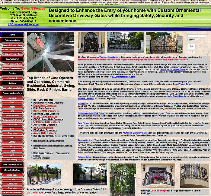
Yikes. Where to begin? This 3-column website has lots of information, lots to look at but almost no good use of white space. There’s so much going on in every column that it just makes me wonder, “What do they want me to DO? How do I find what I’m looking for?” There’s not even a logical menu or search feature to use to look around the site’s content.

This company probably has a lot of really pretty pictures to show with various examples of their work, but their layout overwhelms the visitor with so much text, probably trying to optimize the site for Google search results, that they’re going to lose the human visitor.
Examples of Good Use of White Space on Websites
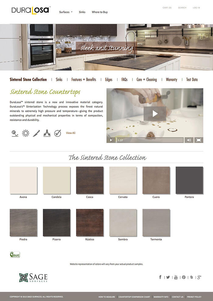
The logo and navigation are easy to identify. Adequate space for sub navigation as well as body text was taken into consideration in building this site. As the user moves down the page it’s visually pleasing to the eye. It does not feel overwhelming. Each element has its place so the visitor’s eye can flow easily down the page.
This site presents the content in an easy to understand format with negative space that’s not technically “white”. Imagery can play a large role in making your site pleasing and interesting to the visitor as it does on this site.
If you’re serious about creating a website that will not only attract visitors but allow you to engage them in the sales process, we recommend you download our free eBook called 25 Website Must-Haves. White space is definitely on that list. Find out what else you shouldn’t forget!
[1] Lin, D. Y. M. (2004). "Evaluating older adults' retention in hypertext perusal: impacts of presentation media as a function of text topology." Computers in Human Behavior, 20.
[2] Olsen, G., D. (2002). "Salient Stimuli in Advertising: The Effect of Contrast Interval Length and Type on Recall"Journal of Experimental Psychology: Applied, 8(3).
Topics:
Website Design
February 23, 2015


