Originally published February 2015. Updated December 2018.
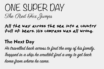
There are 5 font mistakes you don't want to make on your website; they include:
- Using too many fonts
- Using all the same size fonts
- Using illegible fonts
- Using the wrong fonts for the mood
- No typographic contrast
Choosing the best font for a website can feel like playing the memory game. Numerous choices but only certain fonts seem to match. If you make the wrong font choices it can hurt the usability of your website. You don’t want that to happen because the entire point is to make your website easy to use for potential customers.
What criteria should you use to pick the best website fonts? To start, here are 5 mistakes you DON’T want to make with your website font choices.
Mistake 1: Too Many Fonts
 Don’t be the website someone immediately leaves because it’s too busy to read.
A website should use no more than two different font families.
More than that will begin to look too busy and your user will leave and find an easier to read website and never to return. Tragic. Woo them with the beautiful simplicity of your thoughtful font choices. Your user will appreciate how easy it is to read your content by sticking around to learn more about you, thus beginning a wonderful relationship. Notice I said choose two different font families, not just fonts. A font family can include multiple weights of the same font, offering you more choices without adding chaos or clutter.
This section of our site is a good example of the use of only two fonts. The headline for this section, "MISTAKE 1: TOO MANY FONTS" is in one font we've chosen for our site; Oswald. The body text uses our other font choice, Lato. However, within the body of content we also use Lato bold and italic to emphasize important points. So don't feel like the use of only two fonts will make your site look plain or stagnant. There are plenty of ways you can use limited fonts choices and still make your site look elegant and professional.
In addition to the fonts, we recommend you keep some other important design, content and development features in mind as you create your new website.
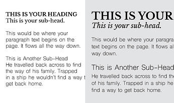
Mistake 2: Same Size Fonts
 Don’t be the website where size doesn’t matter. It does. Font size hierarchy is very important in guiding your user to the most significant information on a page. You’re able to give them a tour of the page without even being there. A well designed page will have a nice flow with the more important billboard text larger, then flowing down to the details that should be smaller. This helps your user’s eye to know immediately what the page is about, then continue reading to learn the specifics. If there is no size variation in fonts used on the page, it can seem chaotic and the user’s eye darts around the page and misses the message you wanted them to learn. Most websites will use no more than 3-4 different sizes for headlines and paragraph text. And hey, I’ll admit...I like big fonts and I cannot lie, you other designers can’t deny (but only in moderation).
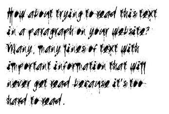
Mistake 3: Illegible Fonts
 Don’t be the chicken scratch website your user can’t read. Picking a legible font seems like common sense but you’d be surprised how many websites out there make this mistake. If you have to ask if a font is illegible, then it probably is. One way to test out if your font is legible is to ask someone over the age of 55 if they can easily read your text. If they struggle, you may need to choose a different font. There are many fancy fonts out there that seem to be the fun, perfect fit for your website, but be sure to keep it simple when dealing with a lot of text on a page. Fonts with a lot of decoration on them are very hard to read in large quantities and small sizes. If it’s just a few large words, the fancy font is probably fine. If it’s a sentence or paragraph, go more simple for easy reading.
Mistake 4: Killing the Mood
 Don’t be the website that kills the mood after you’ve wooed your customer. You’ve started a relationship with a customer and maybe they haven’t seen your website yet. It’s the big moment, the big reveal, and your website font kills the vibe. The fonts on your website can set a certain mood or feeling. This feeling should match your brand and company’s personality. For example, a spa’s website would use delicate, light fonts versus very thick, textured fonts that seem aggressive. This would certainly kill the zen-like spa vibe if the wrong font choice was made. Determine the mood your website should have and find fonts you think express that feeling. Poll your friends and family by asking how a specific font makes them feel if you're unsure. This input will help you pick the best font for your website.
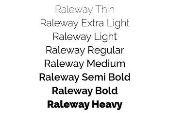
Mistake 5: No Typographic Contrast
 Don’t be the website that looks as monotone as Ben Stein sounds. The fonts you use on a website should have some visual contrast to them. Create a combination of fonts (remember, no more than 2 font families) that have visual differences like thick and thin, serif and sans-serif, italicized and non-italicized, etc. It really helps to choose a font family that includes multiple weights (boldness) of the same font. This way you can mix that one font in different weights with another font throughout your website. Also, for easier page scanning, use bullet lists, section headers and short paragraphs to add contrast.
Font Use On Your Website Can Impact SEO
We've learned that decisions made regarding fonts for a website can positively or negatively impact the experience of the visitors. When the site looks clean and well organized, easy to consume because of limited fonts and smart font usage, it builds trust with the visitor that the site is trustworthy.
There is also one other very important reason that limiting fonts is smart for your website, it helps your SEO (Search Engine Optimization).
When a visitor comes to your site for the first time you want the page to display as quickly as possible. Site speed can depend on a various factors including video and images. Browsers retrieve each file used to display the homepage of your site. The less the browser has to retrieve, the faster it displays the site.
Fonts are also files the browsers must retrieve. Site speed can be affected by having too many fonts. The more files the browser has to pull, the slower your site. This can affect your SEO.
If you’re amped about making sure your website is in tip-top shape to drive traffic and engage users, we're ready to help. Request a free website assessment for some free tips on what you can do to improve your visitors' experience. Or sign up for a free assessment of your website to see if it meets the latest mobile-friendly requirements.
Topics:
Website Design
December 21, 2018


